Velan Ventures
CASE STUDY
A new beginning. A new identity.
THE NEED. |
THE RESULT. |
|
When the creators of Vicarious Visions decided to leave the Activision umbrella, they required a mark of identity to brand their new adventure. They wanted something that they could rally behind. An image to hang their new dreams and goals on. Something that spoke to how they made games before, who they are now, and where they were going.
|
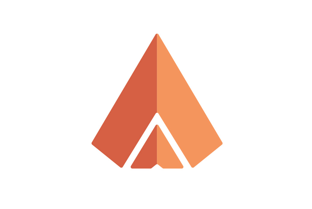
After a few rounds of working with the client, we arrived on a brand that is bold, easily recognizable, and reflects the name of their new endeavor. The new brand can easily be interpreted as a badge worn proudly, and also as a symbol to suggest movement to the future. Plus, it was just really damn fun to work on.
|
PROJECT NEEDS
Mark of Identity
Layout Design
Layout Design
THE STORY.
The previous owners of Vicarious Visions were embarking on a huge adventure. Not only did a ton of decisions need to be made on how to structure and run the new business, but they needed a solid brand for the business. They had already been making games for a couple of decades, built a huge company, and innovated in a variety of directions. Now they were going to do it under a new name: Velan Ventures.
THE STRATEGY.
Velan Ventures was brand spankin’ new, but the business had a ton of experience behind it already. In working with them, we determined the best way to position them was to create something sophisticated. We felt that the brand should do several things.
First, it should be something you notice immediately. A simple shape and color and that can instantly be burned into your brain. Second, we felt it should differ from other start-up studios. Velan Ventures is not a studio that starts in a garage, this is a studio started by people with oodles of experience in the games industry. Not only from the founders, but from the people they wanted to hire as well.
First, it should be something you notice immediately. A simple shape and color and that can instantly be burned into your brain. Second, we felt it should differ from other start-up studios. Velan Ventures is not a studio that starts in a garage, this is a studio started by people with oodles of experience in the games industry. Not only from the founders, but from the people they wanted to hire as well.
Essentially, what we wanted to do, was to make sure their brand stood out, caught your attention, and reflected the professionalism and passion the team has. Some us had worked with the founders in the games industry a few years back. We knew they wanted top quality, and we used that demand to push the brand.
Some of us worked with individuals who started Velan Ventures before. We appreciated how they never settle and would only accept something that instantly spoke to them and their audience. It had to be perfect.
THE DESIGN.
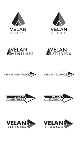
When designing ANYTHING, Metabomb insists on going through multiple iterations WITH the client. We strongly believe that nobody knows how to run a business more than the person who runs that business. So, we worked with the founders to come up with ideas, and push directions that would not only be visually appealing but would make sense in relation to the name of the business, and the attitude of the company.
First, according to the clients, “Velan” means “Spear”. Great! We felt we could incorporate that idea into our design. A spear can have a strong base, with a forward direction. This visual image mirrors the business itself, as it has a solid foundation, and is moving forward, hoping to cut through the competition.
We tried several ideas, trying to incorporate not only a spear, but the first letters of the business as well. The two V’s were essential to the design. So we used the "V's"...but flipped 'em.
This gave us a challenge to come up with ONE image that hinted at a spear, had a strong foundation, a sense of moving up and forward, using the two “V’s”, and was simple and recognizable.
The final mark is something that, once was seen, became the instant favorite. This told us that there was something there that really helps stick out in people’s minds. Success!
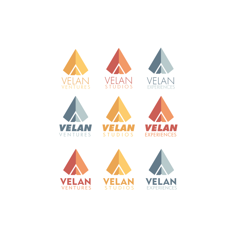
Then we had to apply color. Something energetic and firey was agreed on, as warm colors have the potential to jump out at you. When comparing warm colors to cool colors, it was a no-brainer for us and the client.
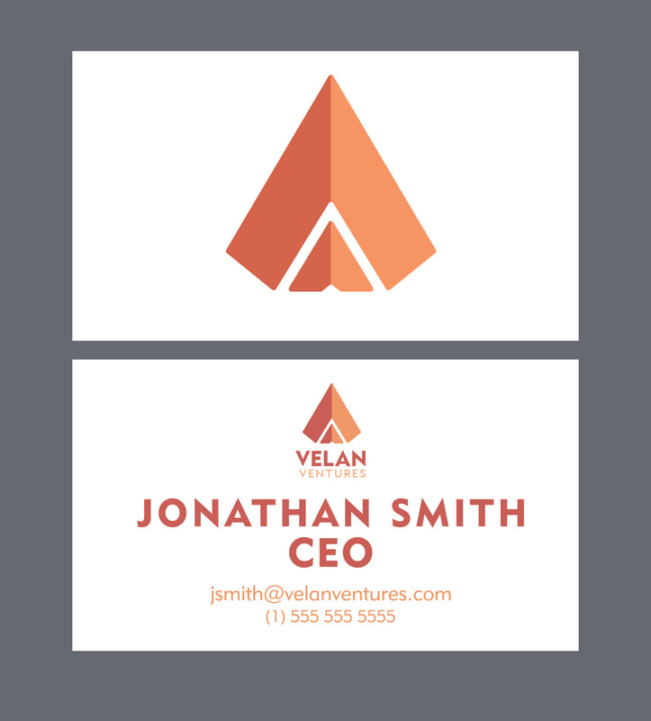
Finally, we were tasked to deliver some stationary branded elements as well. Business cards were also created with the intention of making the pieces functional above all else, but still giving the brand room to breathe and say “hello”.
Ultimately, the clients were thrilled, Currently you can see their brand on their building, shirts, and all that good lovin’! And we gotta say, it looks pretty dope!

