OLDS
CASE STUDY
A Legend Retold.
THE NEED. |
THE RESULT. |
|
Always evolving and never settling, the legendary Steve Olds came to us needing a fresh new brand that reflected his experience, mastery, and interests. In addition, he required a new web experience to display his wild creativity and hardcore concept skills.
|
Steve Olds came away from this experience with a bold new logo that hints at his stamina in the art world, as well as his interests in classic sci-fi concepts. He also has a web presence that has apparently been impressing people with the simplified layout which reflects his minimalists sensibilities.
|
PROJECT NEEDS
Mark of Identity
Web presence design
Social media logo suite
Web presence design
Social media logo suite
THE STORY.
Steven Olds is always putting himself out there to try new things and have new adventures. This assists in pushing him to evolve as an artist. He has been an architect, a concept artist, a creative director, and a even president of a large company. Now Steven Olds is going solo. In this exciting new phase of his life, we were humbled to be asked to assist him in rebranding himself.
THE STRATEGY.
We were excited by the challenge of representing an icon within the creative community. But where to start? How the hell do you sum up a man like Steven Olds who has done everything? When you are going to brand a man who has created countless properties and has worked on nearly every IP you loved as a kid, it can be intimidating....but exhilarating.
The fundamental strategy was to make sure the identity and website were simple and bold with a quiet confidence. Just like the man himself. The logo needed to state WHO he is. Not just in name, but in the presence of the overall design.
Steve Olds was a super savvy client. We would push each other to keep upping the bar with each iteration. Being an acclaimed artist himself, we worked hard on encouraging each other to create a brand that truly reflected his demands for excellence.
THE DESIGN.
Something Steven Olds started saying to us right out of the gate was "keep it simple." It's something we made sure to keep in the back of our minds as we worked through several iterations on the mark of identity. It also served as a guiding light through each step of the design process.
As with any good design, we started with several ideas and options. We were aiming for simplicity during the entire process. But with each step we asked ourselves "What can we strip away here, and still maintain the essence and personality of what we need to communicate?"
We knew that the best option would be a logotype. We knew that Steven Olds would be showcasing his name. And we knew the end result needed to be refined and elegant. In order to get to the most simple and elegant design we could, we started to strip away as much as we could. Things like lines. Things like shapes. Even the first name "Steven."
This gave us the opportunity to really focus on the interesting shapes within the 4 simple letters we had to work with.
Being fans of his art, we knew that harkening back to some retro, science fiction aesthetics could really help hint at the mind of Steven Olds. But we wanted to be restrained about it (remember, simple!!)
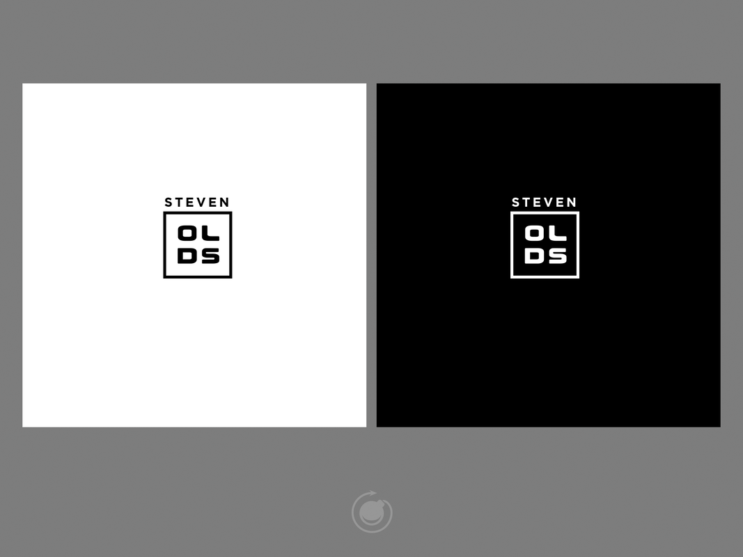
We also needed to think functional! Again, with a minimal simplicity as our guide, we thought of ways we would need to represent these letters. A block format would help save a lot of space when using it to "stamp" work. Also, being arranged in a block would give us greater negative space in certain uses of the logo. More space = simpler!
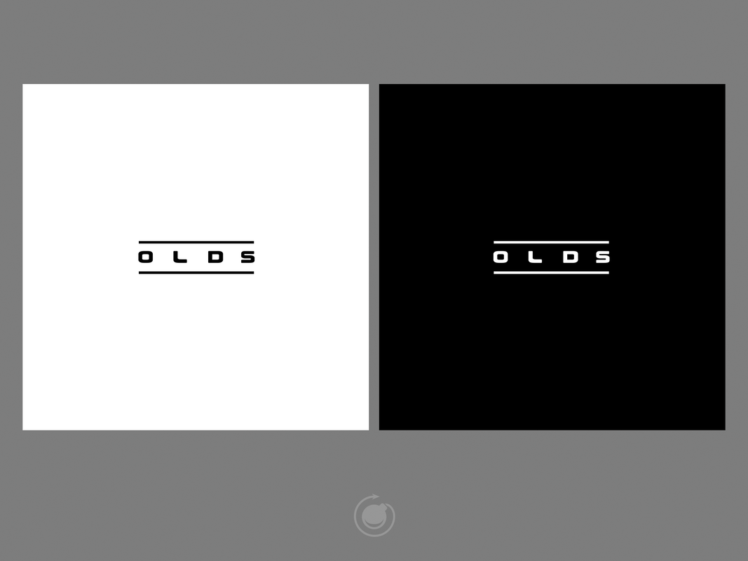
However, we wanted to give Mr. Olds a logo that could be used in a lot of different cases. It was clear to us that we would also need a format that was more "horizontal friendly", so we made sure to work on the spacing so it will work jussssss right.
And finally, through all of this, we were brainstorming color.
While Mr. Olds' work is usually incredibly vibrant, we went back to "simplicity" again. Not only that, but again, the science fiction element. We started thinking of metals, textures, and how to get the color down to it's most fundamental elements. After a thought, Mr. Olds and the Metabomb crew agreed on a beautiful neutral approach.
Black. White. Gray.
At this point, we had a large suite of logos in different neutral shades, and sizes, for every use case.
THE WEBSITE.
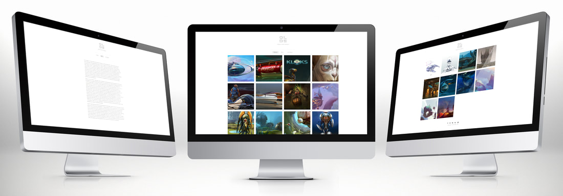
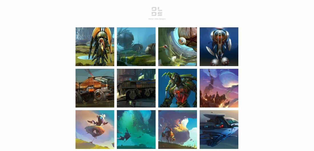
When discussing the web design with Mr. Olds, we all felt it was best to keep the the theme of "simplicity" running throughout site. This not only kept the layout consistent with the logo, but it also helped his work to pop considerably.
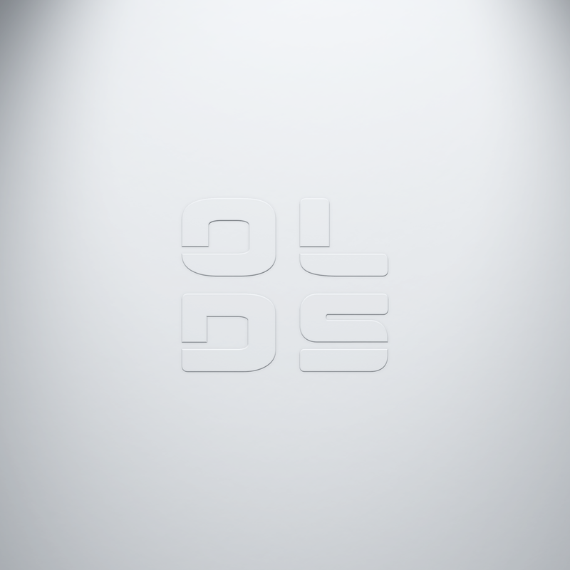
The first thing a visitor will seen when entering the website, is a full screen splash of his logo embossed in in a beautiful neutral scene as if the logo is emerging from something solid. We felt this was a good way to represent the idea that Mr. Olds has been at this for a while, and is a solid asset in the conceptual art community.
Mr. Olds still tells us how the logo and website impresses people when they get a glimpse. We were honored to work with him, and have a bit of pride knowing he got a full suite of useable designs to use for his social media presence, web presence, print, and a new way to sign his work.
Huzzah!

