BRIEFLY
CASE STUDY
Creating Caring Companies.
THE NEED. |
THE RESULT. |
|
Briefly not only needed branding for their ambitious mission, but they also needed a plethora of images and layouts for advertising, communication, and content.
|
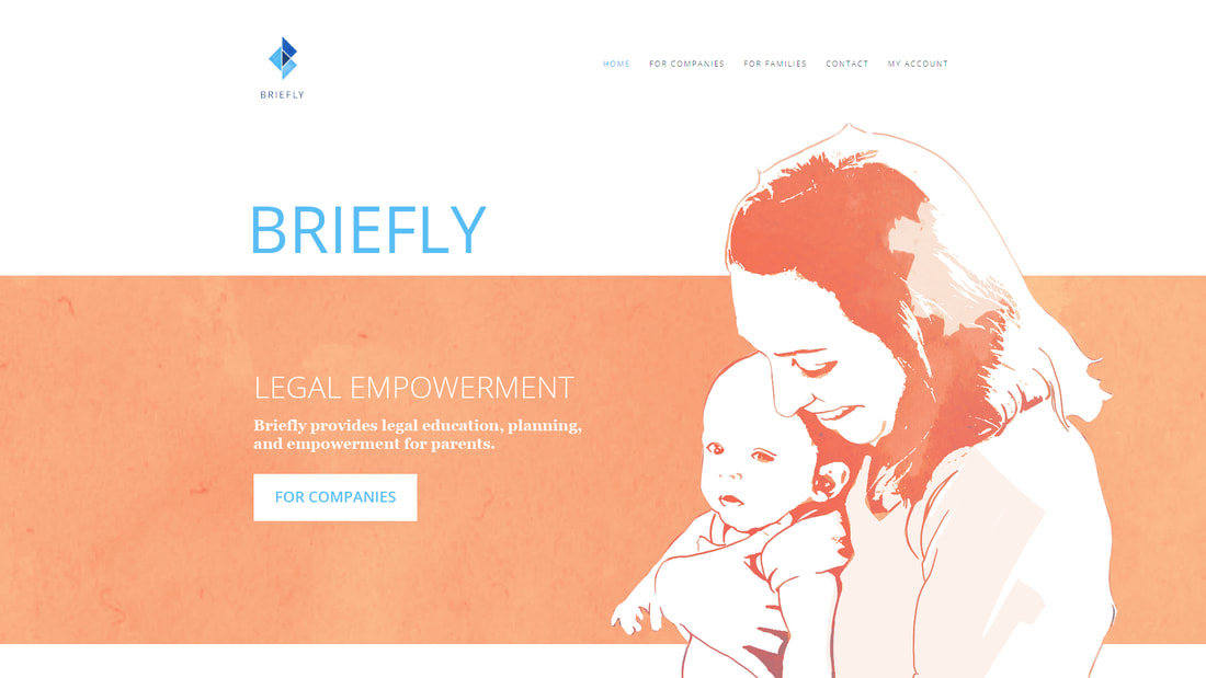
A colorful landscape of shapes and illustrations, marrying the relationship of life events (as it pertains to law) and the people that experience them.
|
PROJECT NEEDS
Mark of Identity
Layout Design
Layout Design
THE STORY.
With a focus on people, Briefly wanted us to help them focus on visuals that would help their customers understand the complicated scenarios of various life events. When educating customers on how they can be empowered to navigate through these events, it was important that visuals are created to make the information more relatable and understandable.
It was also important that the visuals are somewhat interesting to pull people in and make a more comfortable learning experience.
It was also important that the visuals are somewhat interesting to pull people in and make a more comfortable learning experience.
THE STRATEGY.
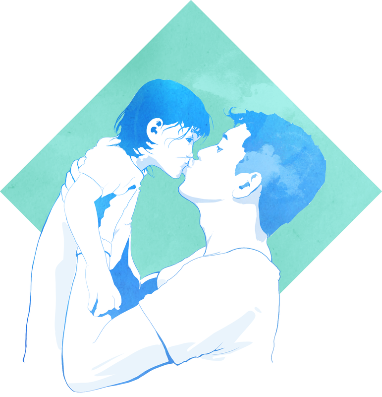
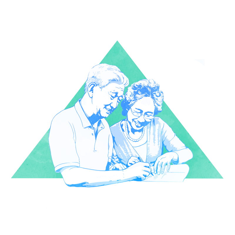
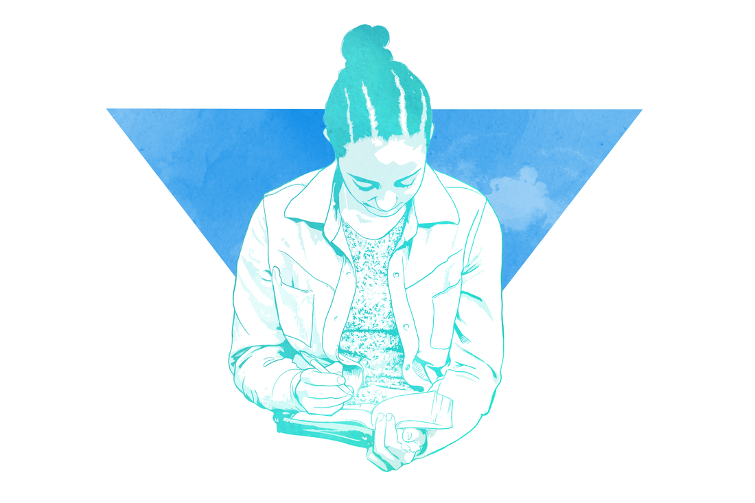
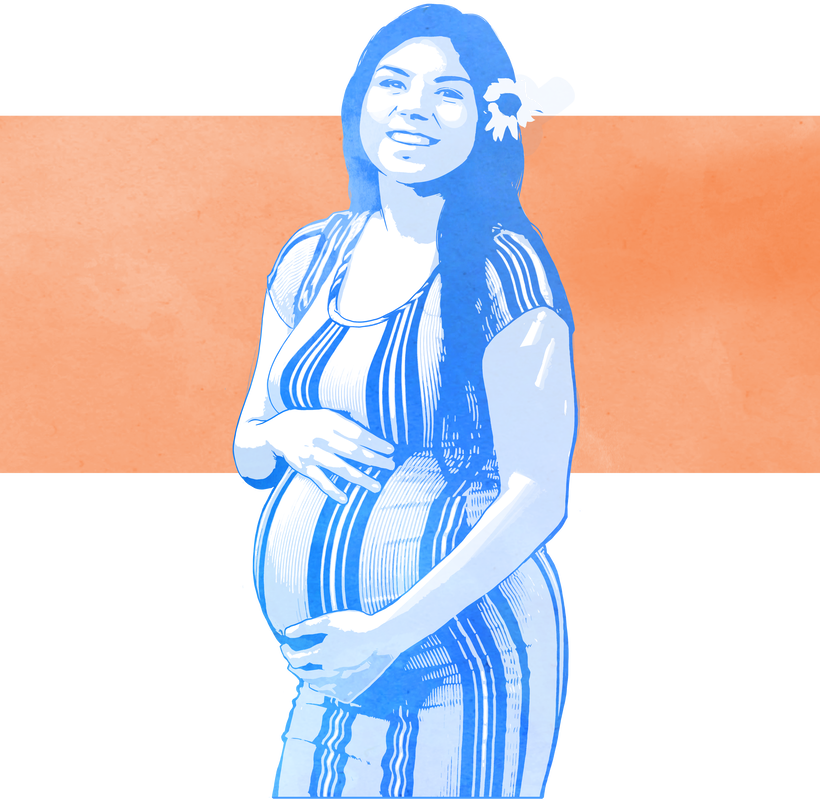
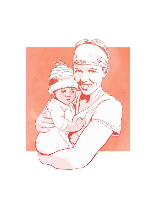
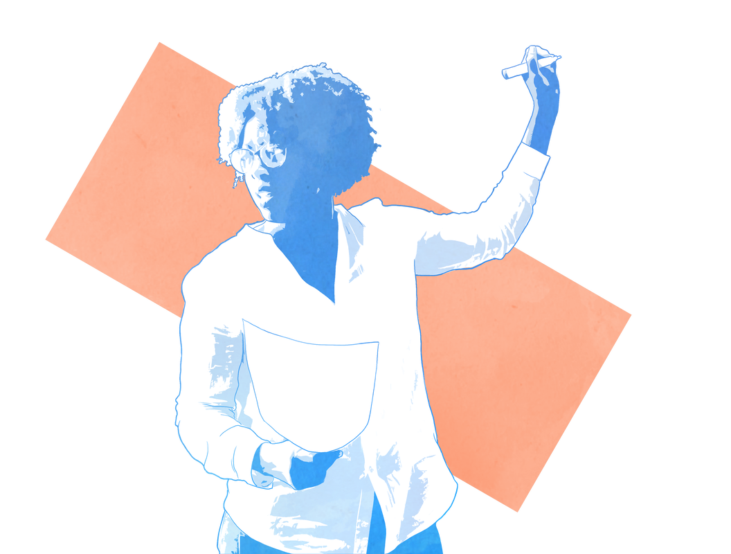
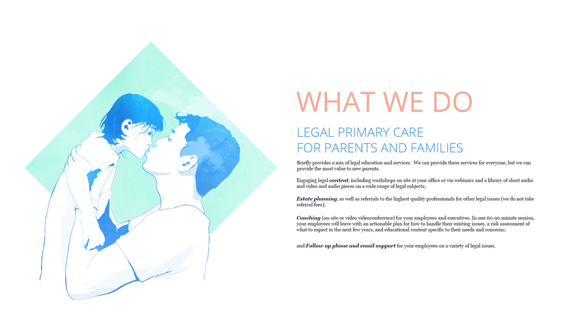
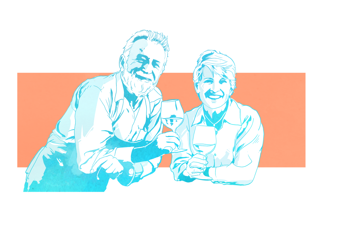
Metabomb felt that since the mission is to help people, then people should be the focus. We felt that by using a contemporary illustrative style, this would showcase what is foremost on Briefly's mind...their customers. We strived for a diverse ensemble of people to represent all the customers Briefly will be helping.
We also wanted to make sure the design style was something that didn't pull the attention away from the valuable education and content that Briefly was providing. Our job was to showcase, and draw people in, as well as help the customers see themselves in these situations. We wanted to hit a style that was interesting to look at, but not distracting.
Briefly was proposing to do something that we really hadn't seen before. We made sure to work with them closely so we could keep up on what they were all about, which would help to inform the design choices. The overall design and branding evolved along with the company itself.
THE DESIGN.
Focusing on people was something Briefly kept mentioning. For us it was clear that we needed to represent all kinds of people dealing with all kinds of life events. Things like expecting a child, becoming a caregiver for a loved one, and even being a parent in the early months of their child's life. When events like these happen in a person's life, they are impactful. They can be intimidating. They can be sacred. So we wanted to display it in a way that was respectful, relatable, and positive.
We also wanted to give some vibrancy and texture to the illustrations that accompany the educational content. Briefly's tone is essentially a company that says "we're here to help you through this, and it's going to be okay."
We were determined to develop a style that said that right out of the gate.
We were determined to develop a style that said that right out of the gate.
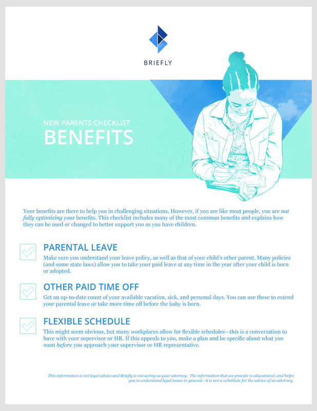
The illustrations mixed with simple geometric shapes, that provide some contrast so the characters can pop off of the page. The geometric shapes also provide us with elements to use throughout a layout. This helps to guide the audiences eye to the pertinent information when creating handouts, or even when perusing content online.
We also felt that another humanistic touch would be the use of a painterly/organic texture amongst all of the imagery. This marriage of geometric-and-digital with human-and-organic hit exactly the right spot for Briefly.
Using modern technology to help people through their human life events.
We also felt that another humanistic touch would be the use of a painterly/organic texture amongst all of the imagery. This marriage of geometric-and-digital with human-and-organic hit exactly the right spot for Briefly.
Using modern technology to help people through their human life events.
Briefly's mark of identity was created with all of these elements in mind. Mixing modern elements, abstract elements, and their mission all in one mark.
We wanted to take some of the visual cues we already developed (Abstract shapes, organic textures) and then work them into a shape that would mean something. As we talked with Briefly more and more, we came to the conclusion that Briefly is really working towards a business model that helps their customers feel safe and whole and healthy.
We wanted a symbol that we could incorporate into the idea of these modern geometric shapes, and even the name of the company itself. Eventually we found that a lotus is a flower and symbol meaning exactly what Briefly is all about. Whole and Healthy.
By taking all those elements, we were able to combine them into on memorable image.
THE LAYOUTS.
Briefly is all about informative content. Information can be a wall of text, or it can be something more.
Again, we wanted to make sure that Briefly had a human feel with everything they do. This includes all the information their customers will find online. By borrowing thematic ideas we've been using with Briefly already, it was a snap to meld them in with informational layouts. Of which there are a lot!
Using the process we had created to nail down our thematic elements helped us to jump in and create layout after layout with relative ease, which was necessary to quickly push out a massive amount of content.
By keeping a tight communication loop with Briefly, we were able to achieve a design that hits everything they are about. Plus, little side note, we're proud to assist in such an important mission as well!

